6 Design Musts for Political Direct Mail in the 2026 Cycle
By Paul Bobnak | October 27, 2020

Editor’s Note: This post was originally published in October 2020 and has been updated for accuracy and comprehensiveness as of April 2026.
To design political direct mail for the 2026 cycle, you need to think about two impressions: a grayscale Informed Delivery preview on a voter’s phone and a full-color physical piece in the mailbox. The six design musts below cover both.
Your political mailer shows up twice. First as a grayscale preview on a voter’s phone at 7 a.m., then as a full-color piece in their mailbox around 4 p.m. With 72.9 million active Informed Delivery users and a 58.6% average email open rate, per USPS’s Informed Delivery Year in Review (April 2024 – March 2025), designing only for the physical piece means losing half your reach before the mail truck arrives. Strong political direct mail design now means designing for both impressions.
Political mail volume keeps climbing, too. USPS delivered 3.37 billion pieces of political and election mail during the 2024 general election cycle, following 3.9 billion pieces during the 2020 presidential cycle, a 34% increase over 2018 per USPS Eagle Magazine reporting. With that much competition in the mailbox, every design decision counts. Here are six musts to help your mail piece stand out in the 2026 cycle.
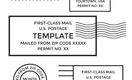
Must #1: Design for the Informed Delivery Crop
By default, the Informed Delivery email shows a grayscale scan of the address side of your mail piece. The good news? Campaigns that register an Informed Delivery campaign can replace that scan with a full-color Representative Image, which USPS specifies as a maximum of 780 x 500 pixels, RGB, JPEG, up to 200KB. Either way, that preview is the first impression most voters get, and it arrives hours before the physical piece.
Here’s how to design with the crop in mind:
- Headline placement. Position your strongest headline in the top third of the address side, above the delivery address block. This is the area most visible in the Informed Delivery preview.
- Grayscale test. Convert your design to grayscale at 300 dpi and check that the headline, candidate name, and logo remain legible. High-contrast elements (dark text on a light background) survive the scan. Gradients and mid-tones often wash out.
- Return-address-side composition. The USPS scans the address side, not the message side. If your address side is nothing but a mailing panel and indicia, you’re wasting the Informed Delivery preview. Add your campaign name, a headline, or a call to action on that panel.
- Ride-along image. Register for an Informed Delivery campaign to replace the default grayscale scan with a full-color ride-along image and a clickable URL. This turns a passive preview into a digital ad.
Must #2: Pick the Right Format
Format affects your cost, readability, and how voters perceive your campaign. Here’s a quick look at how the three main political mail formats compare:
| Format | Best for | Pros | Cons |
|---|---|---|---|
| Postcard (6″ x 9″ or 6″ x 11″) | GOTV reminders, candidate intros | Low cost per piece, no envelope to open, strong Informed Delivery preview | Limited space for detailed policy messaging |
| Self-mailer (8.5″ x 11″ folded) | Issue comparisons, multi-topic outreach | More real estate for copy and images, folds create a reveal | Requires USPS tabbing or glue-standard compliance |
| Envelope mailer | Fundraising, endorsement letters | Feels personal, higher open curiosity | Higher cost, voters may discard before opening |
Postcards dominate political mail for a simple reason: they require zero effort from the voter. For the 2026 cycle, a 6″ x 11″ postcard gives you enough room for a bold photo, a three-second message, and a QR code, all without feeling cramped.
Must #3: Write Copy a Voter Can Scan in 3 Seconds
The JICMAIL Attention Study found that the average piece of direct mail gets about 108 seconds of attention across its lifetime. That sounds generous, but the sort-or-toss decision happens in the first few seconds. Your political mailer is competing with bills, catalogs, and other campaign pieces for that first glance.
So write for the scan:
- Lead with one clear headline that states the voter benefit or the candidate’s single strongest position.
- Limit body copy to 50 words or fewer on the primary side. Use bullets, not paragraphs.
- Place the call to action (vote date, website, QR code) where the eye lands last, typically bottom-right on a postcard.
Every word should earn its spot. If a line doesn’t help the voter decide or act, cut it.
Must #4: Use Photos That Feel Human, Not Stock
Voters connect with photos that look like someone they’d see at a town hall, not a stock library. Informal beats formal every time.
- Use candid shots: candidate talking with voters, walking a neighborhood, or at a local event.
- Keep metadata intact for authenticity checks, but scrub sensitive fields (e.g., GPS coordinates) before sending files to the printer.
- Avoid AI-generated imagery entirely. If an opponent or reporter identifies synthetic images in your mail, the credibility damage outweighs any production convenience.
- Print photos at 300 dpi minimum. Low-resolution images signal low-effort campaigns.
If your team is running high-volume political mail, these specs map directly to press-ready files. Working with a partner like Mailing.com, which handles printing and On-Site USPS Verification in-house, means you skip the extra prepress rework.
Must #5: Get the CTA and QR Code Right
Every piece needs one clear call to action. For the 2026 cycle, we recommend pairing a printed URL with a QR code so voters can choose their path.
Here are the QR code specs to keep in mind:
- Minimum size: 0.75″ x 0.75″ (roughly 2 cm x 2 cm) for close-range scanning. On a postcard, aim for 1″ x 1″ or larger.
- Quiet zone: Leave at least 4 modules of white space around the code. Crowding the code against other design elements causes scan failures.
- Contrast: Dark code on a light background. Avoid inverted codes (light on dark) and colored codes that reduce contrast below 3:1.
- Fallback short URL: Print a human-readable URL below the QR code (e.g., vote.smith2026.com) for voters without a QR scanner or who prefer to type.
- UTM tracking: Append UTM parameters to the destination URL so you can measure traffic by mail drop, audience segment, and format.
- Test before printing. Scan your proofs with at least three different phones (iOS and Android) under normal lighting. A code that works on screen can fail in print if resolution or contrast drops.
Must #6: Place Certifications and Disclaimers Correctly
Federal Election Commission rules require a “paid for by” disclaimer on all public communications by political committees. For printed mail, the FEC says the disclaimer needs to appear in a box set apart from content, in type that is “clearly readable” with reasonable color contrast. The safe harbor for printed communications is 12-point type, per 11 CFR 110.11 and FEC disclaimer guidance.
You’ll also want to be aware of these common compliance marks:
- FSC and sustainability marks. An FSC logo documents responsibly sourced paper and is a small but noticed credibility cue for environmentally conscious voters.
- State-specific disclaimers. Some states require additional language beyond the FEC minimum. Check your state election board before finalizing creative.
Place disclaimers where voters can find them, but don’t let them compete with your headline or CTA. The bottom of the address side or the lower back panel are both solid positions.
Accessibility Is a GOTV Tactic
More than 58 million Americans are 65 or older per U.S. Census Bureau 2023 estimates, and voter turnout in this demographic consistently leads all age groups. Designing mail they can actually read isn’t just the right thing to do. It’s a smart targeting decision.
- Font size. Use 12-point minimum for body copy, and consider 14-point for audiences skewing 65+. Research from the DC Age-Friendly Style Guide recommends 14-point as the standard for adults over 50.
- Color contrast. Follow WCAG 2.2 Success Criterion 1.4.3 and maintain a minimum 4.5:1 contrast ratio for normal text and 3:1 for large text (18-point or larger). Black on white is safest. Avoid light text on medium backgrounds.
- Plain language. Write at an 8th-grade reading level. Avoid jargon, acronyms, and compound sentences that require re-reading.
- Landing page alignment. If your mail drives voters to a website, make sure that landing page meets the same accessibility standards, including screen reader compatibility and alt text on images.
Five Political Direct Mail Design Examples
- GOTV postcard (6″ x 11″). Address side: campaign logo and “Election Day: November 3″ headline in the top third (visible in Informed Delivery). Message side: candidate photo (candid, at a community event), three-bullet platform summary, QR code (1″ x 1”) with fallback URL, and “paid for by” disclaimer in a boxed footer.
- Issue comparison self-mailer (8.5″ x 11″ folded). Outer panel: bold question headline (“Where do the candidates stand on education?”). Inner spread: side-by-side comparison table with sourced data points. Back panel: QR code linking to full policy page and disclaimer box.
- Fundraising envelope mailer. Outer envelope: candidate name and “Personal Message Inside” teaser. Letter: hand-signed note with a specific ask amount and deadline. Reply card: pre-addressed return envelope and donation form. Disclaimer on the letter footer in 12-point type.
- Door hanger (3.5″ x 8.5″). Single headline at top: “Your polling place has moved.” Map graphic showing new location. QR code linking to a polling-place lookup tool. Bold date and hours. Disclaimer at the bottom. Designed for high contrast (dark blue on white) to meet accessibility standards.
- Palm card (3.5″ x 5.5″). Front: candidate headshot, name, office, and party. Back: five bullet points (one per local issue), election date, QR code to campaign site, and disclaimer. Sized to fit in a pocket or hand out at events. Font set at 12-point minimum for readability.
FAQs
What size should a QR code be on a political postcard?
Aim for at least 1″ x 1″ on a standard postcard. Keep a quiet zone of 4 modules (white space) around the code, use dark ink on a light background, and print a short fallback URL underneath for voters who’d rather type.
Does Informed Delivery work for all political mail formats?
Informed Delivery scans letter-sized mail pieces, including postcards and envelope mailers. Self-mailers and flats may not always generate a preview image, though. To control the preview image and add a clickable link, register for an Informed Delivery campaign through your mail service provider.
What are the FEC disclaimer requirements for political direct mail?
The FEC requires a “paid for by” notice identifying who financed the communication and whether it was authorized by a candidate. On printed mail, the disclaimer needs to appear in a box, in clearly readable type with reasonable color contrast. The safe harbor for print is 12-point type per 11 CFR 110.11. Be sure to check your state for any additional requirements.
Design for Both Mailboxes, Physical and Digital
Designing political mail that works in both the digital preview and the physical mailbox is no longer optional. The 2026 cycle will be competitive, and the campaigns that treat Informed Delivery as a real channel, not an afterthought, are the ones that will reach voters first.
When you’re ready to get your next political mailing into production, request a quote from Mailing.com. We’ll put together a production timeline and format recommendation so you can move forward with confidence.